This UX Design project was created to enable parents to manage both their and their children's schedules.
The Problem
Busy families need to manage mutual schedules in a centralized, seamless way.
The Goal
Design an app that will let users manage multiple schedules, which will affect busy parents and families by allowing them to add events to a central calendar.
My Role and Responsibilities
As the primary UX researcher and designer, I completed foundational user research to find user pain points, created personas, designed wireframes and low-fidelity prototypes, created high-fidelity prototypes using Figma, and competed user testing at multiple stages to refine designs.
User Pain Points
Four main pain points were discovered during foundational research. First, while having scheduled items written down was a good start, users struggled to remember the events after their calendar was closed. Second, users access their schedule with multiple platforms and devices, and have trouble finding an app that will work reliably across all platforms. Third, simply sharing individual calendars to everyone in the family was too much information for users. They became overwhelmed by the volume, especially if much of another's calendar didn't pertain to them. Finally, users experienced scheduling conflicts because they did not have access to all the previously scheduled events. This led to a need to reschedule things, cancel, or split duties (e.g., one parent attending one child's event, while the other attended a second child's event).
User Personas
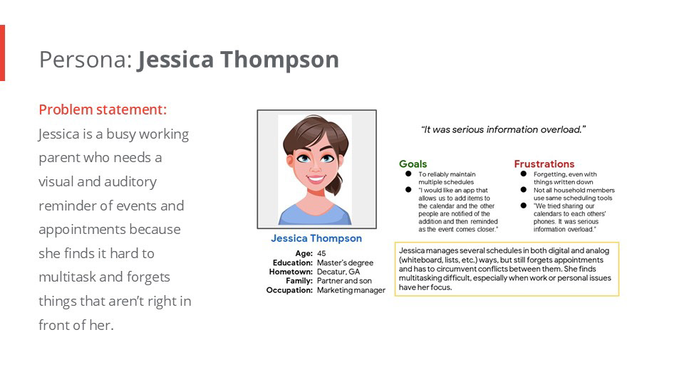
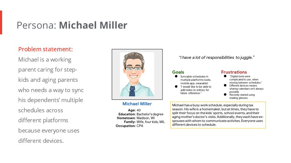
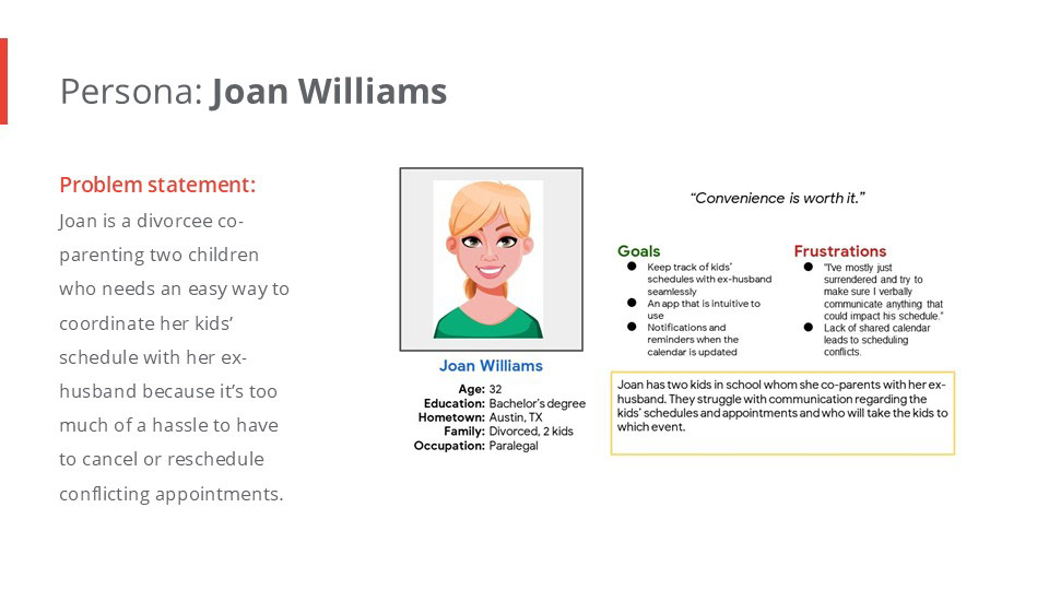
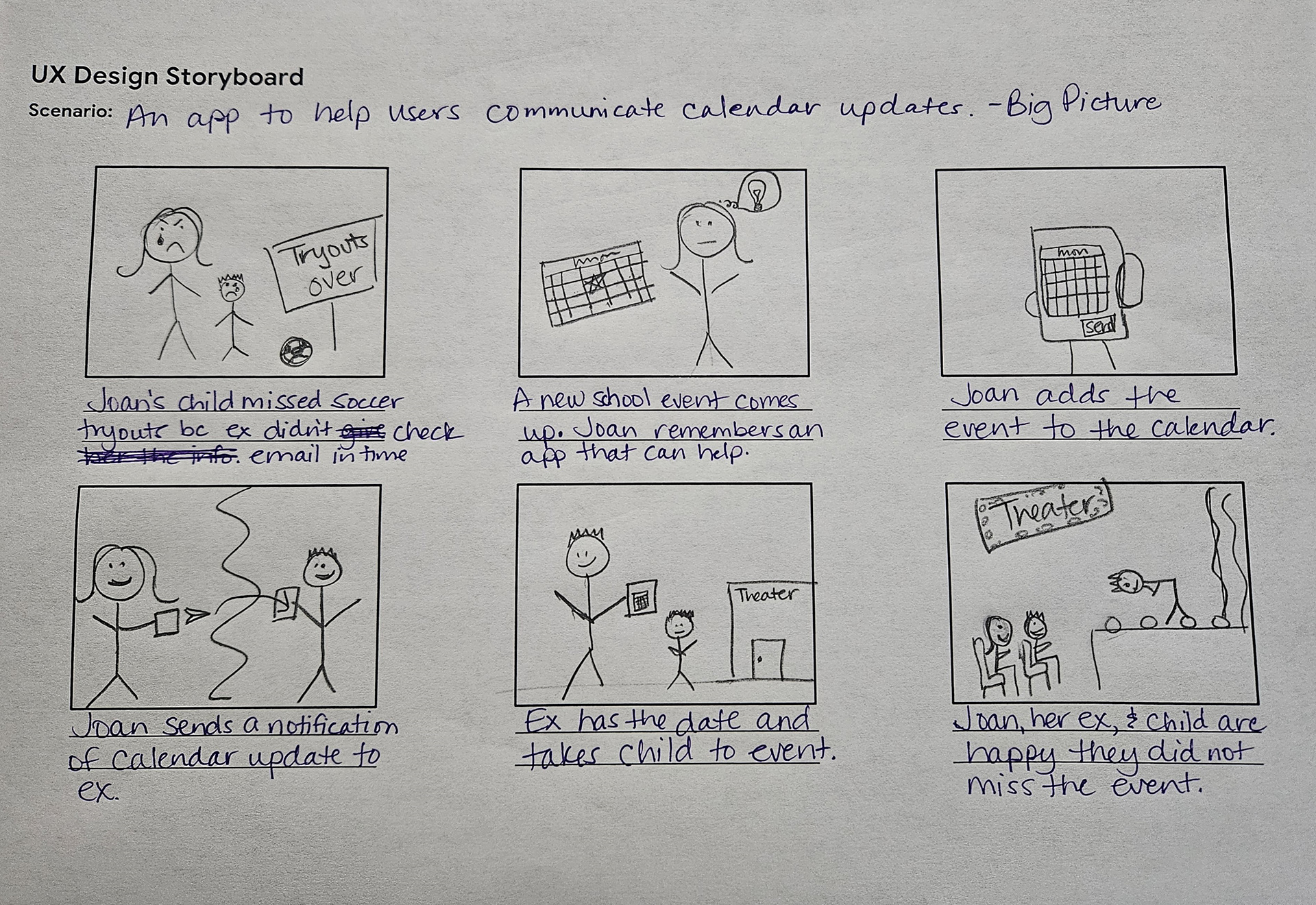
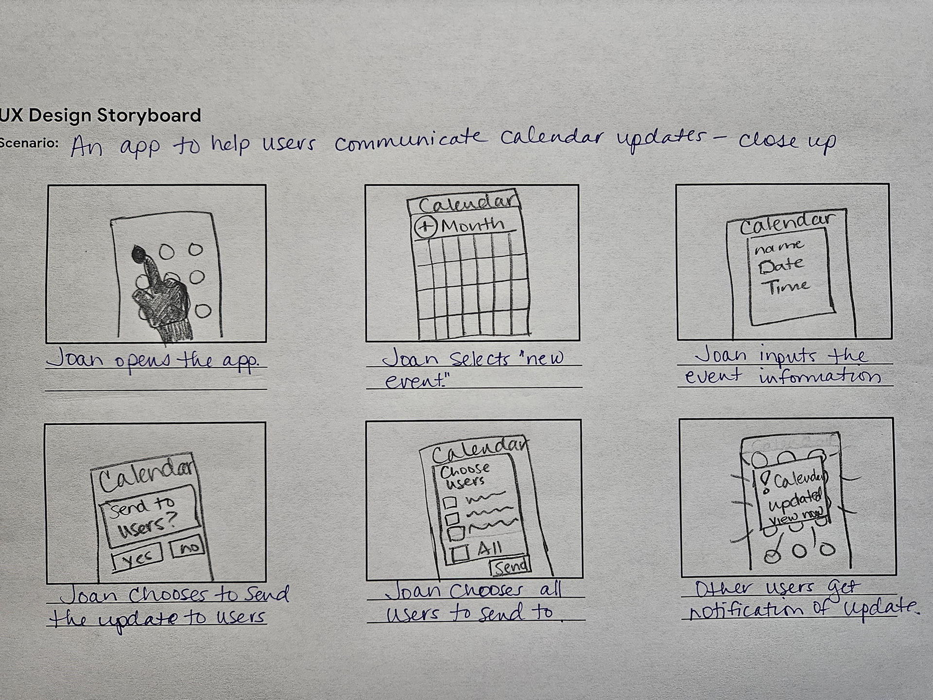
Storyboards
Paper Wireframes
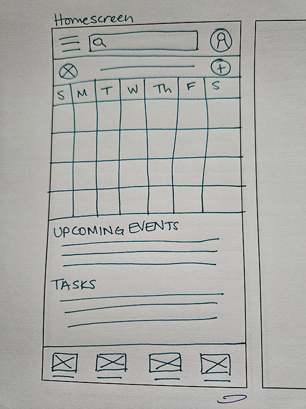
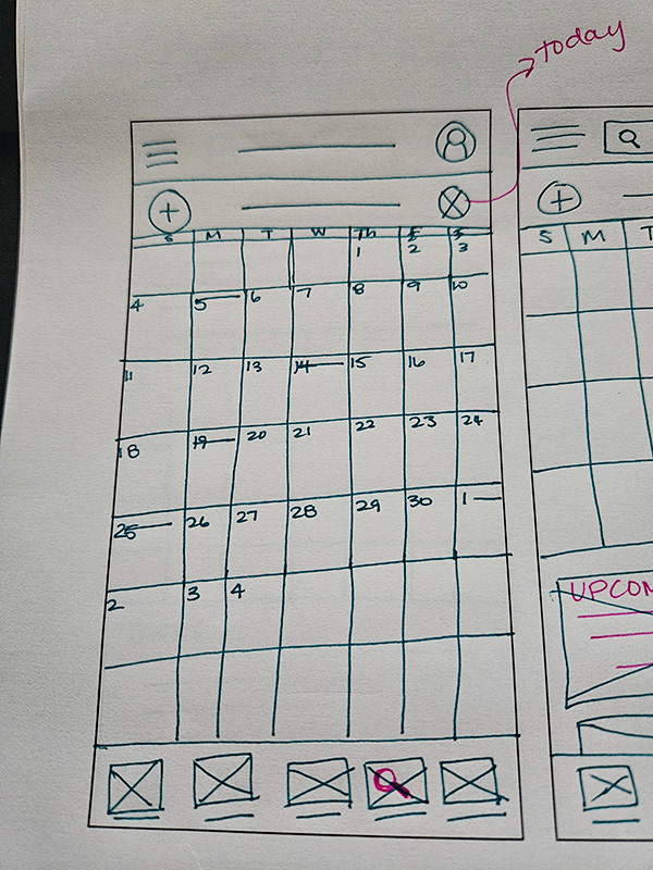
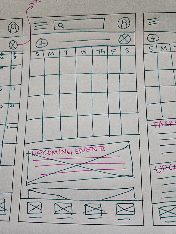
As I was sketching, I started to think about placement of items that were most likely to be used often, like "Add an event" and moved it from the top left to the top right. I also considered that some people are less visual and might need a list view of upcoming events, rather than just a calendar view.
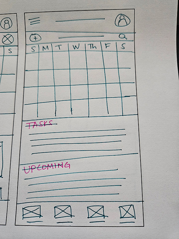
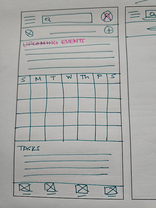
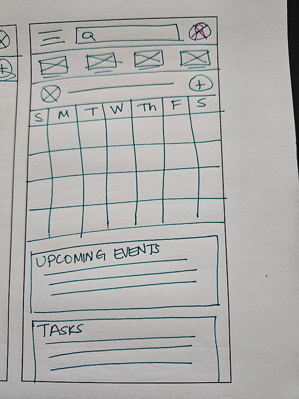
Digital Wireframes
Home Screen: The placement of the Add Event button was changed from the paper wireframes after doing research on best button placement on mobile devices.
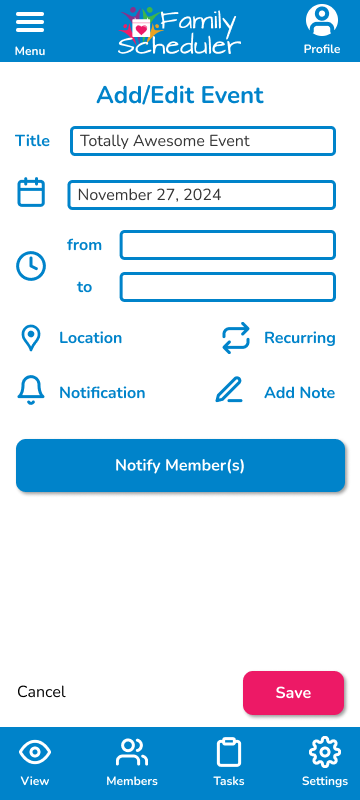
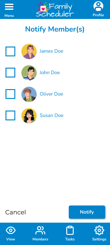
Add Event Screen: The ability to alert members to event changes is one of the main features to help facilitate communication between users.
Low-fidelity Prototype
First Usability Study Findings
I conducted moderated remote testing (via Zoom) with 6 participants. They were 3 men and 3 women, aged 16 to 70, with varying degrees of technological knowledge/skill. Key performance indicators for this study included conversion rates, user error rates, and a system usability scale. Findings were as follows:
1. Adding new members was confusing
2. Navigating back to the home screen was confusing
3. Profile icon was not clear to users
System Usability Scale average: 48.75, which indicates the app needs adjustments to increase usability.
1. Adding new members was confusing
2. Navigating back to the home screen was confusing
3. Profile icon was not clear to users
System Usability Scale average: 48.75, which indicates the app needs adjustments to increase usability.
Refining the Design: Mockups
Having the Add button located under the calendar on the Home screen was obvious to users, but they struggled to find how to add anything beyond a new event. I adjusted the Add button to include multiple options in a pop-up menu.
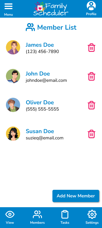
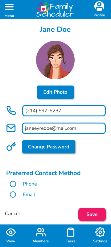
The original intention of the membership to a calendar was to avoid merging multiple calendars, which was a pain point with other apps, according to preliminary user research. Therefore, the idea was to invite others to a central calendar, keeping access control with the original users. The invited member, however, would control their contact information and preferences to maintain their agency.
Based on usability testing, the initial design made this intention unclear. After the first round of usability testing, the design was adjusted to include a paragraph explaining how to invite a member to set up an account, linked to the main user's calendar.
High-Fidelity Prototype
Second Usability Study Findings
I again conducted moderated remote testing (via Zoom) with 4 participants (2 men and 3 women, aged 18 to 51). Key performance indicators in this study included conversion rates and user error rates. Second usability study findings were as follows:
1. Users found the app more intuitive
2. Navigation was easy
3. Titles added to icons lessened confusion
1. Users found the app more intuitive
2. Navigation was easy
3. Titles added to icons lessened confusion
Accessibility Considerations
1. Icons are used not only as visual interest, but are also meaningful. To reduce confusion, text is also included for most icons. This helps people of all reading levels to navigate the app's main features.
2. While bright colors were chosen for the logo and to indicate that the app is intended for families, colors were also chosen based on contrast for those struggling with poor vision or color blindness.
3. The size of fonts and buttons were chosen to increase readability. Additionally, increased white space helps the app feel not only open and uncluttered, but also more user friendly for touch input.
